
Just on the edge of China Town in San Fantastic-rancisco is a tech co-op space called The Vault. It’s underground, it’s full of computer-bound entrepreneurs, and it’s on the old site of the famous Ghirardelli chocolate factory (circa 1863). That’s right, this one’s an antique.
As nobody in the space seemed to have the foggiest idea of the place’s historical significance, the community manager (SO MANY STARTUP WORDS) decided an old advertisement for the chocolate factory would be the perfect fit for the reception area’s mural. Only problem was that I’d never actually done any text on a mural – ever… And as this was more of a ‘replicate and exaggerate’ sort of job, I needed to be a little more planned/precise/particular about how I would get this thing up on a wall, rather than just freestyling it as I usually do. It was also to be on a grey wall and using only black paint, unlike my standard bright colours – so I managed to pull the ‘artist’ card and bargain a bit of gold into the equation too.
The whole thing was rather a trendy sounding idea.
So I did a bit of photoshop work to see how it could be placed, fused the advertisement with some doodles from an old Ghirardelli sign that I liked, projected it on the wall, slapped some masking tape on the straight line edges, and got hectic with the black paint. When I say hectic, I mean as precise as possible. (Neck pain for days. I’m fine now though, thanks Klaus for the amateur chiropractic work.)
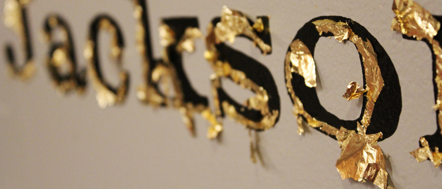
I did have to take some liberties with the text as the blocky resolution of the projector proved to be only adequate for a rough guide. Anyway, once it was all done, I had intended on gold leafing just the shadow of the heading (as planned, and shown in red on the projection). Needless to say, that freestyling side of me came out in the eleventh hour, and significantly more gold leaf ended up getting chucked on the wall. Which I’m stoked about, because not only does gold leaf look like Willy Wonka’s golden ticket, it is also just basically extremely epic.
I have been breathing out gold leaf dust flecks ever since, like a mythical creature. Note to future users of gold leaf: probably wear a respiratory filter unless you plan to attend some sort of dungeons and dragons convention every day for the rest of your life.

Original advertisement

Sign with doodles I liked

Fused together and shadow added

Existing reception space

Photoshopped to see design in the reception space

projected into the space

Taped up straight lines

All black everything aka murdered out mural

Gold as planned

Gold not as planned

dangly gold floating in the air!

gold

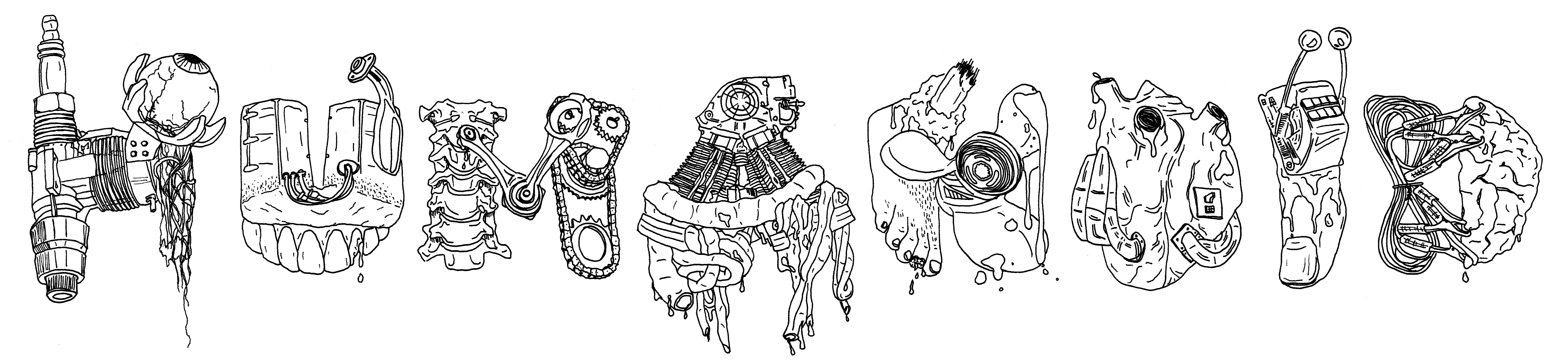
mural illustration


